



7 Reasons This Simple Jersey Conquered Sports History
The Montreal Canadiens jersey is one of the most enduring, most recognisable, and most emotionally charged pieces of sportswear in the history of professional athletics, and its longevity is not accidental. Every element of the design, from the bleu-blanc-rouge palette to the interlocking CH monogram, reflects decisions made with deliberate intent and preserved across more than a century of play.
While the NHL has cycled through franchise rebrands, alternate colourways, and the aggressive graphic experimentation of the edge jersey era, the Habs jersey has remained essentially unchanged. It has not merely survived those shifts in Montreal Canadiens jersey design, it has emerged from each one with greater cultural authority than before.
What follows are seven specific, evidenced reasons why the Canadiens jersey has achieved genuine iconic status in design, culture, and sport. Understanding those reasons tells us something useful about why the Habs jersey is iconic, what Montreal Canadiens uniform history actually teaches, and what any well-designed garment must do to outlast its era.
1. A Colour Palette That Cannot Be Mistaken
The visual foundation of the Canadiens jersey is its three-colour system of red, white, and blue. Arranged in high-contrast bands, the bleu-blanc-rouge provides maximum legibility under arena lighting and across television broadcasts.

Teams designing their own apparel face these exact visibility challenges today, which is why organizations seeking reliable performance wear source Sports Gear Swag’s custom hockey jerseys inspired by the classics. This functional correctness existed long before the colors became culturally significant.
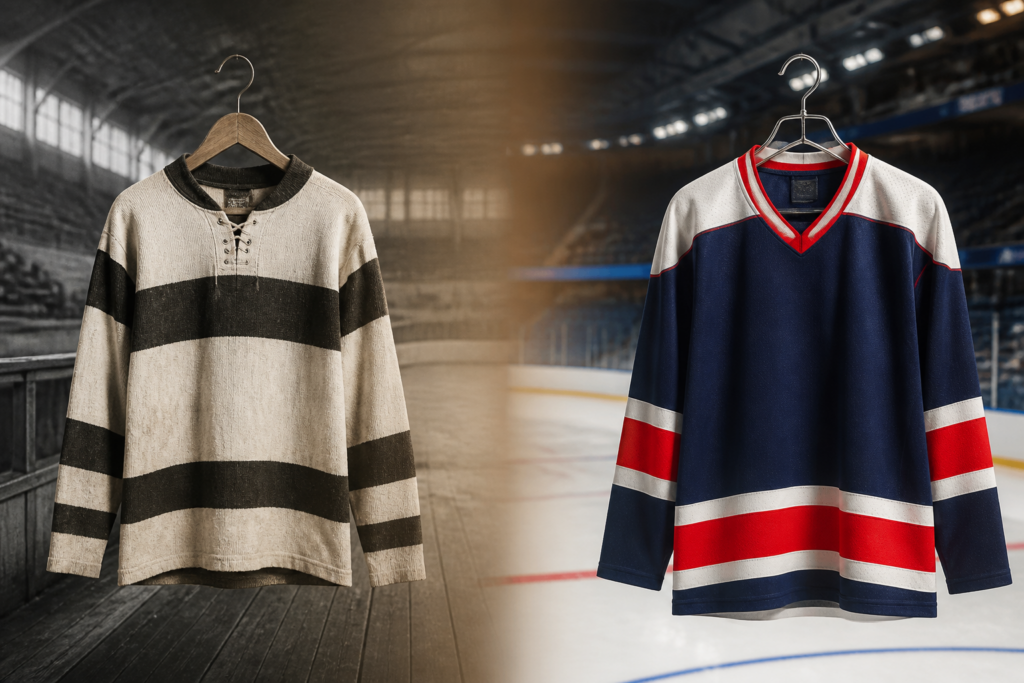
Bold vintage stripes were dominant for part of the hockey jersey’s trajectory. The Montreal Canadiens jersey has gone through several striped looks!
This historic three-color approach has remained essentially unchanged from the earliest sweaters of the 1910s through to the current design.
Minor adjustments to striping proportions and fabric technology have occurred across eras, but the three colours themselves have never been replaced or supplemented with a fourth. Third jerseys, seasonal alternate colourways, edge-era gradient experiments, and full rebrands have been the norm for dozens of franchises. The Canadiens have skipped that cycle entirely.
The tricolour also carries nationalist resonance within Québec that extends well beyond sport. It connects the jersey to a broader cultural and political identity that no graphic designer could manufacture after the fact.
Brand strategists across flag design and national institutional logos have arrived at the same principle independently.
| Key Insight: A limited colour palette ages against nothing, because there is no trend cycle it belongs to. The Canadiens discovered intuitively what brand strategists later formalized: simplicity is functional longevity. |
2. The CH Monogram And Contested History
The CH monogram sits at the visual centre of the jersey, featuring interlocking letters arranged with clean geometry.
This crest remains immediately readable at any scale, whether viewed on a player’s chest or as a thumbnail on a mobile screen. It reproduces clearly across merchandise, broadcast graphics, and arena signage without losing its visual coherence.

The colours have gone from surfer blue to electric but the Canadianred and basic logo structures always remain the same.
The club’s official position dictates that the “H” in the monogram stands for “Hockey”, specifically Club de Hockey Canadien. The popular attribution of “H” to “Habitants” is historically imprecise, though it persists in fan culture with incredible tenacity.
A logo that people research, debate, and feel personal ownership over lives inside the culture rather than sitting above it. The monogram also holds meaning for both francophone and anglophone Montréal simultaneously. Almost no single symbol in that city achieves this specific bilingual resonance.
Many North American professional sports logos undergo modernization efforts that strip away cultural relevance, but the CH holds firm.
| Key Insights: The jersey has not changed substantially enough across eras to break the visual line, which makes it a wearable archive rather than simply a current uniform. |
3. A Century Of Continuous Visual Identity
Current players pull on a visual identity that Maurice Richard wore during his historic career. They wear the exact layout Jean Béliveau sported across his championship seasons. Guy Lafleur championed this same look through multiple Cup victories in the 1970s.
Many franchises alter their visual identity so frequently that no thread connects their modern jersey to their founding design. The Habs’ jersey represents an unbroken continuity driven by repeated curatorial decisions.
The organization chooses to preserve the identity rather than refresh it, treating the jersey as an institutional object rather than a commercial product subject to seasonal revision. The Stanley Cup championships the Canadiens have won exist within the jersey’s design rather than apart from it. Retired numbers act as deliberate design decisions about what the garment means. Each retired digit narrows the jersey’s visual real estate further, intensifying the symbolic weight.
More into Soccer swag? Check it out here.