Cultural heritage contributes to our identity and way of life. It is woven in the DNA of our metropolis, providing a link to the roots of the community and its people. Culturally a community is richer for having the tangible presence of past eras and historic styles.
As long as there have been businesses, there has been a need for signs. From swaying wooden plaques during Revolutionary times to billboards of the 1920s, brands have relied on attractive custom outdoor signs and signage visibility to stay in business.
Your Road map to 20 vintage signs in Montreal

Map of patrimonial signs of interest located in Ville-Marie
In a Montreal context the following were chosen for their landscape value, esthetic and social contribution. Follow the road map to Montreal’s vintage signs to start your time travel!
1- Guaranteed Pure Milk

Guaranteed Pure Milk at 1025 Lucien-L’Allier Street
In service from 1930 to 1990, the milk house Guaranteed Pure Milk was founded in 1900, when the milk industry was in high demand with the urban population on a sharp incline. Thanks to a Heritage Montreal campaign, named “Save the Pint”, the commercial sign was restored in 2011. Admired by professional photographers and amateurs the pint is often used for artistic means to represent Montreal.
2- The Ritz-Carlton

Montreal’s Ritz Carlton at 1228 Sherbrooke Street West
Founded in 1896 by Swiss hotel owner Cesar, also known as the ”The king of hotels, hotel of kings” its first establishment of the Ritz-Carlton chain was built in 1898 at Place Vendome in Paris. Inaugurated in 1912 on Sherbrooke Street West, a sector bustling with art galleries and modern boutiques, the hotel franchise was the first to settle in North America. Nicknamed at the time “The First Lady of Sherbrooke Street”, The Montreal Ritz-Carlton is considered to be the most famous commercial building in Montreal.
The entrance roof top is adorned at each extremity of a 75 feet in length iron marquee. A unique lion crest (funding body) and a crown (Royal British hallmark stamp) was added in 1978.
3- Holt Renfrew
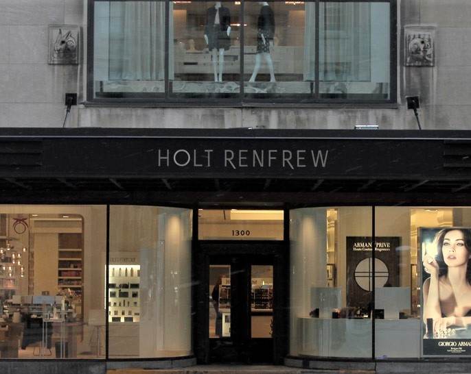
Holt Renfrew at 1300 Sherbrooke Street West
The company was founded in 1837 by William S. Henderson, an Irish merchant. Considered to be one of the founding retailers still in business today. The Sherbrooke Street store opened in 1946 where once resided Montreal’s department stores. Recognized as the more stylish of the department stores not only in Quebec but Canada.
The building is inspired by the Art déco style, the sign was installed in 1948 above the main entrance of the store on Sherbrooke Street West, since transformed into a window display. It also happens to be the only sign made of brass and produced in Ville-Marie.
4- Canadian National (CN)
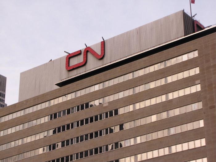
CN at 935 De La Gauchetière Street West
Founded in 1919 by a number of existing railway companies, CN is one of two railway companies of Canada with Canadian Pacific. Built in 1961 the current head office is part of a vast complex established by CN (Central station, Queen Elizabeth Hotel) in a district marking our railway history in Canada, at proximity of the Canadian Pacific head office in Windsor Station.
The CN signage happens to be one of the first luminous of its kind in the downtown core installed on the rooftop of its head office tower. Conceived in 1959 by the graphic designer Allan Flemming. the logo’s timeless style illustrates a connected “C” and “N” evoking fluidity and movement of a railway track. It is a reminder of the importance the railway industry has had in Montreal’s history and the recognition it obtained as a central pivot of North America’s railway industry. Positioned on De La Gauchetière West and Mansfield, the 2 signs where the two stations were located. Historically passengers would arrive at the Bonaventure terminal (now Square Chaboillez) and visibly identify the Head office of the company.
5- Place Bonaventure

Place Bonaventure at 800 De La Gauchetière Street West
Built between 1965 and 1967, it is a one stop office building and hotel, having hosted in its 53 year existence a reknown exhibition hall. Within the complex are the head offices of the railway company Canadian National, Central Station, the Queen Elizabeth Hotel and railway overpass.
The signage on Place Bonaventure, installed in 1970 is apparent as you drive into the city on Boulevard Robert-Bourassa as well as the railway tracks headed out to the suburbs. The only thing that has changed is the colour, switched from red to blue.
6- Birks
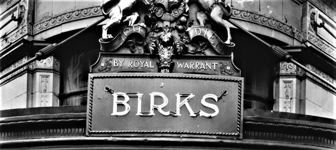
Maison Birks at 620 Sainte-Catherine West
Founded in Montreal in 1879 by Henry Birks, the family jewelry enterprise (once known as Henry Birks and Co., followed by Henry Birks and Sons) a street side gable of the former business district situated on Saint Jacques Street. With the evolution of the metropolis, the store moved in 1894 on Saint Catherine Street West, facing Square Phillips, in the commercial sector at the height of Montreal’s jewelry district. It quickly became the leader in the watchmaking and jewelry sector, and its window display a indispensable attraction on Saint Catherine Street.
Situated on the rounded corner of the building, the golden sign was slightly modified since its original installation in the 1930s. The inscribed ”Henry Birks and Sons Limited” was replaced by ”Maison Birks Est. 1879”. The name Birks on the sign has its original, distinguishable typography.
7- Farine Five Roses

Farine Five Roses at 930 Mill Street
Specialized in wheat flour the Ogilvie Flour Mills enterprise was founded in Quebec in 1801 and Montreal in 1859. Credited for opening the gateway to the cereal commerce in Western Canada, the mill was considered the most important in Canada.
The original sign was erected in 1948 with the inscription “Farine Ogilvie Flour”, 15 feet in height and made of metal. In 1964 ”Ogilvie” was replaced with ”Five Roses”. In 1977, the English term “flour” was removed to conform with the French language charter.
After the brand Five Roses was sold in 2006, Heritage Montreal was able to convince its new owners ADM and Smuckers to preserve the emblematic sign illuminating one of the most important entries into the city.
8- Photo Service

Photo Service at 222 Notre-Dame Street West
A family enterprise founded on Saint Denis Street in 1937, Photo Service opened its subsidiary branch in Old Montreal in 1945. Truly a Montreal institution specialized in photography equipment, the commerce employed hundreds of employees in its hey day. Its neon sign dates back to 1950.
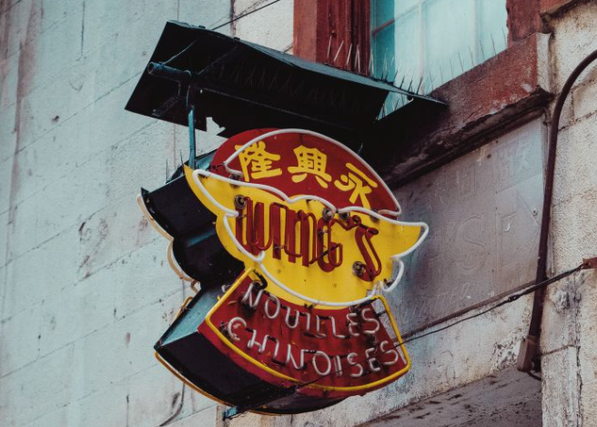
9- Wing’s Nouilles chinoises

Wing’s Nouilles chinoises at 1009 Côté Street
Founded in 1897 under the name Wing Lung by Hee Chong Lee, a Chinese immigrant, business man. Nouilles Wing Limited is one of the first operating businesses in China Town. Its primary specialty is the import and export of Chinese products, the enterprise eventually expanded into food products like rice noodles, imperial rolls, wonton soup and fortune cookies dough in as of 1946.
Its current sign was installed in 1967 (Nouilles Wing Limited), inspired by the original sign located on Sainte Urbain Street. The sign shape and neon in the wings refers to the English term of the business. The colours painted on the metallic understructure are those of the Chinese flag, yellow and red. The neon colours also include a hint of green to add to the yellow and red. The sign is on De La Gauchetière Street West.
10- Hydro Québec

Hydro Québec at 75 René-Lévesque Boulevard West
A symbol in Quebec of electricity, Hydro-Quebec is a key player in the energy sector, the main electrical producer in Canada and biggest global producer of hydroelectricity. The provincially owned enterprise’s head office is located on René-Lévesque Boulevard East, since 1962.
Its logo was placed on the rooftop edge of the building’s head office in 1964. Its subtle logo represents a solar disk pierced by lightning, a timeless symbol representing electricity. An important point of reference for Montreal, one being night fall, the sign Hydro-Quebec is inscribed in a series of illuminated signs on Downtown rooftops which began to emerge in the 1960s.
11- La Presse time clock

La Presse time clock at 7 Saint-Jacques Street
Founded in 1884, La Presse is the largest francophone daily newspaper in North American and is still one of the most active in Quebec. The media enterprise was established in 1900 in the Old Montreal, on the corner of boulevard Saint-Laurent Blvd and Saint-Jacques Street, considered to be the “newspaper street” in the 19th and 20 century.
Like a number of buildings from the Saint-Jacques Street era, the time clock was installed on the La Presse building in the years 1920-1930. After its removal, a reproduction was created in 1983 to commemorate its 75th anniversary. Inspired by its original look, it is composed of a rectangular prism with a clock on each side, and above it, a 1920s logo of La Presse. It happens to be the only clock with 4 sides to it in the borough.
12- Cafe Cléopâtre (West side)

Cafe Cléopâtre at 1230 Saint-Laurent Boulevard
The cabaret and strip joint was established in 1979 at the heart of the Red Light district of Montreal, now known as the Quartier des spectacles.
Its signage is a reminder of the hustling and bustling commercial activity that took place in the part of the city. Since the 20th Century, the building has consistently hosted erotic cabarets, notably the Café Colorado (1930-1936), Café Sierra (1946-1950) and Café Canasta (1954-1971). From its panel of lighting from the original sign as well as on other parts of the building, the business contributes to the nightlife of Saint-Laurent Boulevard where a number of retailers are open in the evenings into the late hours of the night.
12- Montreal Pool Room (East side)
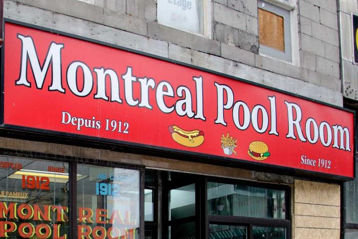
Montreal Pool Room at 1217 St Laurent Boulevard
Bulgarian immigrant Filipoff Dakov is the founder of one of the best-known restaurant landmarks on the Main. The Montreal Pool Room is located in the city’s former red-light district on Saint Laurent Boulevard. Opened since 1912 is known for its underground allure.
Under pressure to make way for the Quartier des Spectacles, the century-old establishment moved across the street, on the East side of St Laurent. There were functional pool tables at one point, they were removed for as long as I can remember!
Its latest signage was installed for its 100 year anniversary. The location was also originally across the street and was the same font as what you see in its window.
13- Hat maker Henri Henri

Hat maker Henri Henri at 189 Sainte-Catherine Street East
The oldest hat maker Montreal and family enterprise, still open for business was founded in 1932 by Honorius Henri et Jean-Maurice Lefebvre. There was an era when politicians had a sense of duty to go to Henri Henri. As a matter of fact the business popularized the expression “hat trick” in hockey during the 1950s and 1960s. The players who accomplished the feat of scoring 3 goals at the Montreal Forum were rewarded with a free hat.
The retailer was located at 289 and 255 Sainte-Catherine Street East, before moving to Hôtel-de-Ville Avenue in 1983. Its vertical sign is similar to the original one, bearing the top hat.
14- Hotel Nelson

Hotel Nelson at 421 Place Jacques-Cartier
Philias-Arthur Benoît opened l’Hôtel Nelson on the Place Jacques-Cartier in 1941 in a building where a number of hotels flourished since its foundation in 1865. In the 1970s the establishment was the principal setting for the novel Le Matou (1981) of Yves Beauchemin. With the hotel no longer in existence since 1980, it remains a historical memory thanks to the restaurant Jardins Nelson which settled in the building.
During the installation of its signage in 1941 Hotel Nelson was part of an ensemble of wall mural paintings, facing Place Jacques-Cartier. Most of them are no longer legible or visible; the Hotel Nelson one is the best preserved one with the La Sauvegarde one on Notre-Dame Street East.
15- Archambault

Archambault at 500 Sainte-Catherine Street East
Founded in 1896 by Edmond Archambault, the mini empire Archambault launched its business at a small counter located on the corner of Sainte-Catherine Street and Saint-Hubert Street East.
In 1929, the business moved into an Art deco styled building on Sainte-Catherine East and Berri. Archambault originally focused on sheet music before becoming the primary Quebec source in purchasing record and musical instruments.
The original sign was installed in 1930 and was one of the very first neon signage in Montreal. The shape of the top part replicates the building’s ground level window. The harp, symbolically representing poetry and chants symbolize the low relief situated underneath each parapet of the building and its musical instruments. The vertical neon part of the sign was replaced in the 2000s by a reproduction light emitting diodes. In November 2018 it was disconnected only to be restored and reinstalled by September 2019.
16- Da Giovanni

Da Giovanni at 572 Sainte-Catherine Street East
The family franchise specialized in Italian cuisine opened its doors in 1954 on the corner of Sainte-Catherine East. It took place during the Italian Immigration wave in Montreal, creating an Italian restaurant trend. In the 1960-70s it was considered the go-to restaurant for Italian food where there were line ups outside its establishment due to its popularity.
The Da Giovanni sign is visible from Sainte-Catherine Street East, a main commercial street of patrimonial importance in Montreal, exemplified by its retail landscape and luminosity. Its integration with the its textured, colourful characteristics and green mustache is a visual representation of the kitsch movement.
17- Théâtre L’Olympia

Théâtre L’Olympia at 1002-1018 Sainte-Catherine Street East
Since its construction in 1925, two cinematographic theaters emerged within the establishment to eventually become in 1980 a concert hall. Over the years the Montreal institution has hosted many local and international acts, including the famous play theatre Broue for a span of 17 years!
The sign is a take on what used to be Cinéma Arlequin, from 1968 to 1980, representing it with its original vertical structure. In 1969 when it was originally installed there were a number of other vertical signs similar to L’Olympia which gradually all disappeared.
18- Northeastern Lunch

Northeastern Lunch at 1001 Sainte-Catherine Street East
A popular Montreal restaurant franchise in the first half of the 20th century, the restaurant served meals at affordable prices 24/7. The cafeterias when its client served themselves became very popular following the Great depression in the 1930s.
The original signage on Sainte-Catherine Street East re-emerged to the public after a fire incident which took place in February 2014. Composed of mosaics, the sign is of patrimonial interest as commercial archeology. It also inspired a poem for one of Leonard Cohen’s, at the base of one of his literary endeavours.
19- Molson Brewery

Molson Brewery, 1670 Rue Notre‑Dame Est, Montreal
Founded by John Molson in 1786 on the edge of the Saint-Laurence river, the Molson brewery is the 2nd oldest company after the Hudson Bay Company. An incredible feat for a North American industry, the brewery is located in the exact spot, since its foundation. The Molson family also actively participated in the development of the Centre-Sud district during the 19th and 20th century.
in 1966, the rectangular shaped structure on four levels covered in a coat of brick was specially built on the fermentation of the brewery’s building for create more visibility for the industry from îles Sainte-Hélène et Notre-Dame in view of Expo 67. 2 lettered signs were installed on the north and south side of the structure as well as a clock, on the west side. The original clock was replaced in 1980 to the current illuminated, octogonal shaped one.
Impressively large dimensions (approximately 5 meters in hight for the letters and clock), the signs are visible from a number of locations, one being from the Jacques-Cartier bridge and Longueuil. A reference point for Montreal, these signs are a reminder of the industrial character for this Montreal sector where there are very few signs of the sort nowadays. Truly an emblem of the city of Montreal, the signs and clock of Molson often illustrate Montreal.
Best Kept MTL always likes to end with good news! Aware of the importance in protecting our richness, the Ville Marie sector put in place in November of a very 1st plan showcasing 10 concrete interventions to preservation of our heritage in build and inform our community taking care of history.
For more on Montreal’s heritage check out the award winning documentary ”Into the light with Cité Mémoire” review here.


